How to create a rental booking concept that aligns with small business branding.

Beaver’s Bend Marina
Overview
Role
UX Designer (Freelance and Remote)
March 2019 - April 2019
Research skills applied
Guerilla User Testing, Secondary product research, Competitive Analysis
Design skills applied
Wireframes, Design comps
Tools used
Sketch, Zeplin
The challenge
I was brought mid-way into the project to help a group of engineers and the client to release booking software with a customer experience and an admin experience within 4 weeks. My responsibility was to deliver a design concept on both sides of the experience that aligned with the new branding guidelines the client had wanted. Beaver’s bend marina is a small boat rental company located in Oklahoma looking to create a new rental site for their business to attract a more younger and tech-savvy customer group. The business hypothesis was that the new design concept will help boost marketing and allow the engineering team to finish development on the project at budget.
Pre-requisite
Engineering was committed to using the Clarity design system on the admin experience to cut back development time.
The original design for the customer experience was scrapped and I was allowed to design from scratch.
All the team members on the project were remote and freelance contractors
The branding document did not have a new logo yet but it did have colors and fonts.
How did I approach the challenge.
Due to the short timeline, I had to quickly understand the problems the client was having and get alignment toward a visual direction. I spent 2 meetings with the client to talk about the business and his needs.
This is what he shared.
Preserve functionality of the admin experience but did not like the designs of the customer experience.
Prioritized marketing to younger people as his primary challenge
Referenced inspiration from Airbnb and Kayak often when talking about what he wanted
Worried about budget risks by not hiring a designer early on in the project
Wanted something that mainly looked great but also was not difficult to use like his old system
Afterward, I made a basic plan to spend 2 weeks going through a round of testing
My design principles
Use the 80/20 rule to prioritize work - Spend 80% time on building high-fidelity concepts and 20% to test and research usability issues.
Limit design explorations to the top 2 concepts to minimize meetings and feedback sessions.
Leverage guerilla testing methods and secondary research to maximize time on iterating through feedback.
Prioritize the visual exploration of the customer experience and focus more on solutions that were easier to implement on the admin side.
Utilize existing templates as much as possible
Learn to break traditional processes to make time
Design exploration - customer experience
Analyze existing journey and competitive analysis
I started by creating a rough journey map of the client’s current experience. I mapped the major pages and screens we would need to build the primary shopping experience. I used low-fidelity napkin sketches to highlight and indicate a rough basic layout of each page. The focus here was to go quick and dirty to understand the flow.
Create basic branded UI components
I minimize the time I would have to spend to push pixels and fine-tune my delivery. I create a set of basic components and limitations to allow myself to work faster and limit the design choices I needed to make.
Type REM scale of 6 (easily divisible by 3 and 2) - Easier to use and be flexible for different patterns
Primary colors (using the blue color communicated through the brand guidelines) - chose to keep it to a monochromatic color palette to limit design variables.
Supporting colors (off-white and off-blacks) - It was a common trend with Airbnb and other travel reservation sites to utilize a flatter design style and focus on negative space.
Validation Colors - Reds, oranges, and greens for success and warnings.
CTAs and Links
Leverage basic components to create more complex modules
After I created the basic components, I used them to create modules that were inspired by Airbnb and Kayak individually and made 2 concepts respectively. These modules were mapped to the larger page layouts, I had made earlier when analyzing the journey.
Find free asset resources on open-source websites
To respect the client’s budget, I found a free icon library and a collection of stock photos on Pexels to not only allow the client to envision the final deliverables as I prepared for the design review, but also gave me a collection of branded assets to use in my wireframing.
Wireframes


I combined all the work I had done up to this point and created an end-to-end wireframe flow to present to the client.
Design Review
Met up with the client and the client decided to go towards the Airbnb approach as he felt the UI was more recognizable and familiar. I had suggested that it would be beneficial to him, if we could test the concept and he agreed.
Guerilla testing at local church
To address the usability challenges the client was having, I shared my prototype with 7 20-30 year olds at my church to find any usability problems that I could quickly address. The task was simple, book a boat rental.
Communicate feedback with client and update wireframes
Most of the participants appreciated the designs reminded them of Airbnb and thought the overall experience was enjoyable and easy-to-use. When timed it took the users about an average of 9 minutes to complete the experience, while the bulk of the time was spent browsing through the listings. Some of the users thought that the pictures were the most engaging piece and if it didn’t have great pictures it would not sell well.
Based on that feedback, I found more alluring stock photos and communicated to the client the feedback.
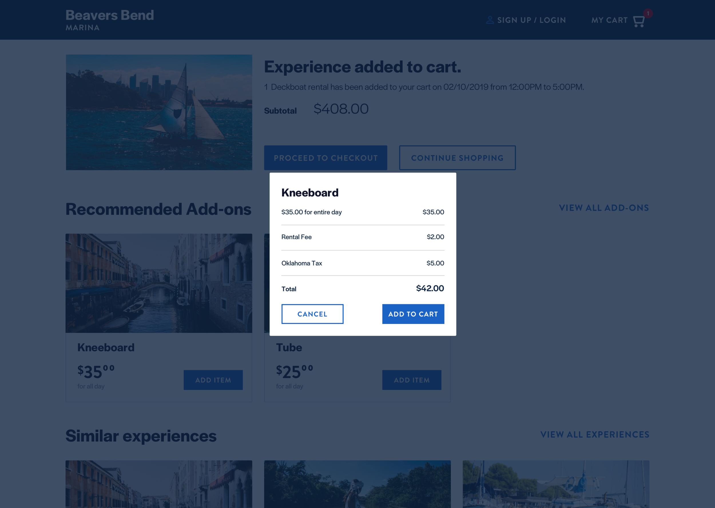
Final customer experience deliverable
Design exploration - admin experience
Evaluate current admin prototype
Considering most of the experience was already implemented into the prototype. My focus was to find as many low-hanging design problems to tackle and address. The most common was form design and layout. I chose to focus my 1 week towards making a better form experience.
War-rooms and wireframe
Luckily the engineering team was available throughout the entire engagement. I had suggested we use a war room approach where we got on a Zoom meeting for 3-4 hours a day to quickly iterate and execute designs. By the end of the week, I had made the most impactful changes to the signup, adding a boat, and set product pricing pages.


Wrap-up and documentation


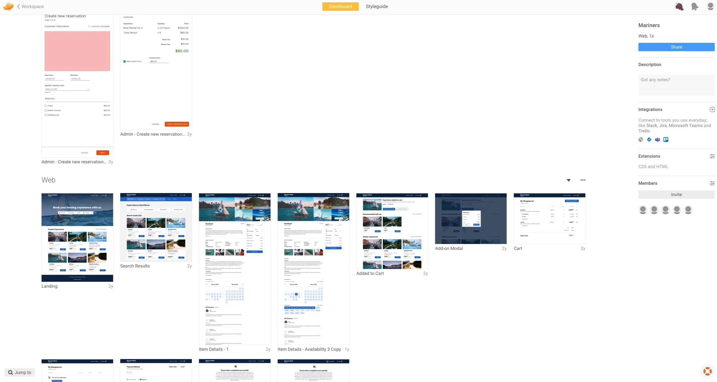
Asset handoff through Zeplin
For the last 2 days of the project, I created a Zeplin project with all of the assets and comments on the experience and presented it to the entire team alongside my final farewell to the team members.
